From Expression to Orientation: Redesigning Brand Pages for Trust and Conversion

Context
A D2C food brand with a genuinely strong story — traceable sourcing, lab-tested purity, fair farmer payments — was struggling to convert the high-intent traffic landing on its brand and product pages. The brand meaning existed; users just couldn't parse it fast enough to act on it.
The Problem
The pages were visually heavy but structurally ambiguous. They were expressive — not directive.
- High-intent traffic, but low decisiveness
- Content-heavy layouts with weak hierarchy
- Brand meaning present, but hard to extract
- Users struggled to form confidence quickly
The audit surfaced a critical pattern: when hierarchy is unclear, users don't make wrong decisions — they delay them.

Behavioral Insight
Watching how users actually moved through the pages revealed three consistent behaviors:
- Skimming over long narrative sections
- Visually searching for proof and reassurance
- Pausing before committing, especially on product detail pages
The design was asking users to believe — before helping them understand.


Design Hypothesis
If we reduce interpretive effort, surface meaning earlier, and align hierarchy with decision-making, then confidence will form faster, hesitation will reduce, and conversion becomes a by-product — not a push.
This meant a deliberate shift in the design language:
| Before | After |
|---|---|
| Brand expression | Brand orientation |
| Narrative-first | Meaning-first |
| Visual richness | Visual clarity |
| Implicit trust | Explicit trust cues |
The Approach: Designing Around Cognitive Flow
The pages were restructured to answer users' questions in the order they actually ask them:
- What's the brand about? — immediate clarity
- Why is it credible? — proof and verification
- Why is it different? — brand differentiation
- How do we build trust? — trust context
- Where do I act? — a clear action path
Key Design Decisions
Batch-first experience. Users can enter a batch number and instantly access the complete product journey — turning traceability from a claim into an interaction.
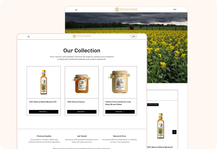
Tabular transparency. Nutritional data, cost breakdowns, and pricing were restructured into scannable tables. The full selling price was decomposed publicly — milk cost, processing, logistics, lab testing, even the profit margin — replacing generic descriptors with clear, comparable differentiators.
Proof over promises. Lab results, farmer payments, harvest windows, and processing methods were surfaced upfront as primary content blocks, not buried supporting material.
Designing for hesitation points. Wherever users paused, reassurance was placed: reinforced trust cues near CTAs, simplified choice architecture, secondary distractions removed, and quality and sourcing clarified visually. A repeating visual rhythm placed reassurance near every decision moment.
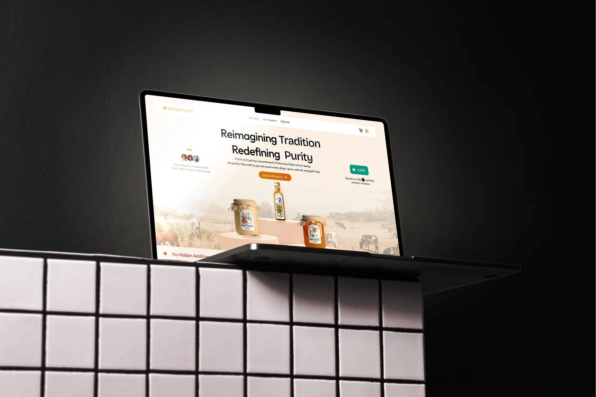
Calm, earth-rooted visual language. Warm, earthy tones and minimal UI — deliberately avoiding fear-based or clinical aesthetics common in the "purity" category.

Mobile-first recomposition. With mobile as the dominant context, dense layouts were rebuilt for vertical clarity, keeping trust signals and actions always within reach.


Before & After
Drag to compare the old page against the redesign.
Impact
Post-redesign indicators:
The redesign didn't increase persuasion — it reduced interpretation effort.
Learnings
- Brand pages are sense-making surfaces, not just storytelling canvases
- Trust must be architected, not assumed
- Hierarchy is a growth lever
- Good design reduces doubt — not choice